


Trick like Bridget Riley
Trick for ad's sake


Have you ever done a magic eye? Or tried to figure out whether that drawing is a duck or a rabbit? Is the dress blue or gold? You’ve seen Optical Art.
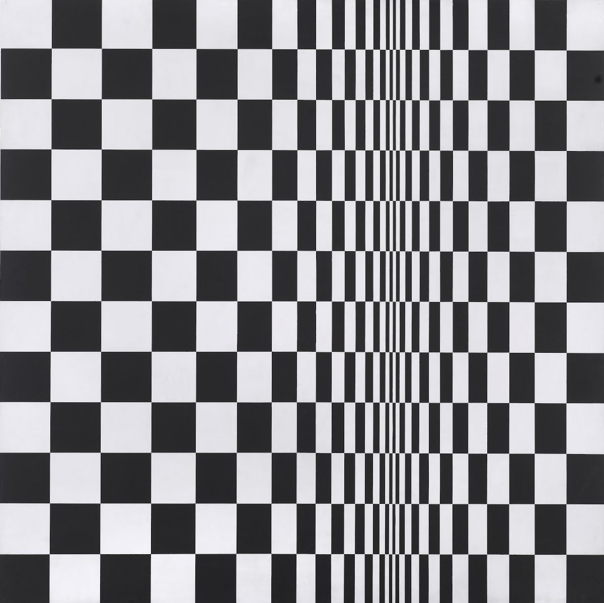
After a short stint in advertising as a commercial illustrator, in the early sixties Bridget Riley began her art career proper. Her first Op Art pieces were always black and white, formed of simple geometric shapes formed into mesmerizing patterns.
The basis of the approach was through impersonal geometric abstraction.
Don’t you just love art-speak?
In Riley’s words:
“I couldn’t get near what I wanted through seeing, recognizing and recreating, so I stood the problem on its head. I started studying squares, rectangles, triangles and the sensations they give rise to… It is untrue that my work depends on any literary impulse or has any illustrative intention. The marks on the canvas are sole and essential agents in a series of relationships which form the structure of the painting.”
The audience’s participation in Op Art was key.
Through being drawn in and hypnotized by the works, they were complicit in something akin to The Happenings of the time period. But who needs mind-altering hallucinogens when you can just go to a gallery – or at the very least, you could try both.
Much like chemical narcotics, whose behavioral outcomes were completely opposed to the rigorous science that created them, Riley’s precision art was the result of meticulous planning and testing before paint met canvas.
She would study and arrange every stroke of the design and composition, creating a full blueprint of the piece, before instructing her team of assistants to execute.
Op Art channeled the unsettling, disturbing vibrations that lay beneath the bright hopeful exterior of the sixties. It was a decade of doubt, anxiety and apprehension – the threat of nuclear war ever imminent.
Seems like a particularly appropriate time to revisit it then…
It’s a kind of magic
 | Artsy")


There's no doubt that monochromatic Op Art was a huge part of the sixties aesthetic, and the optical illusions that this graphical approach can offer, whilst potentially gimmicky, can produce some arresting results.
Illusions can be engrossing and engaging, as well as incredibly satisfying. They can also make us look twice – a feat that not enough ads encourage.
Here’s some linear classics from the 60s:


Animal Collective fan? Alcoholics Anonymous came first with this woozy effort.

A simple but effective ad from coke looks like you can hold it.

Optical illusions offer a massive opportunity to troll.
Penguin or giraffe? Jeep lets you see what you want to.

Frightfully good work from the BBC involved some carefully placed stakes and lighting.

Honda do love a weird one. I always enjoyed seeing this satisfying one on the telly.
Like, comment and subscribe etc!
Thanks for reading,
Jonathan ✌️
Groovy baby
Want to hear more about Bridget Riley’s mathematical approach to visual chaos? Listen to her episode of Kunst Please: