


Uniform like Le Corbusier
Uniform for Ad's Sake


Have you ever noticed how architects have a particular penchant for round glasses?
It’s because of Le Corbusier.
Le Corbusier’s original design for his glasses was a slight oval shape made with a heavy black frame.
His friends started calling him “Corbu”, a pun on the French word for crow due to the beady, bird-like look the customized glasses gave him, especially when perched on the tip of his beak.
As his career started to pick up steam, the glasses became a sort of ancillary signature to his new moniker. Le Corbusier was patient zero for the “architect's glasses” uniform trope, and in the early 1930s he would infect another carrier.
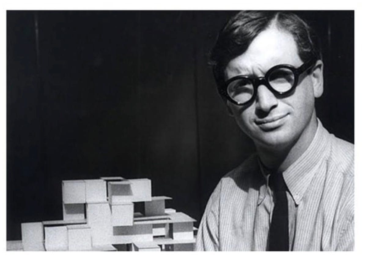
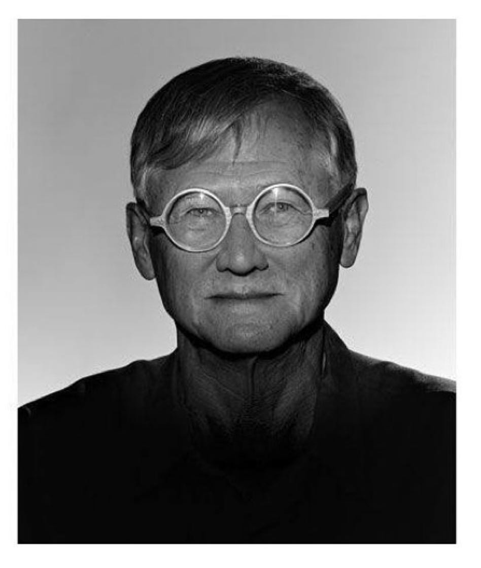
Philip Johnson was a Harvard Graduate, a member of the architecture department of the brand new New York Museum of Modern Art, and a Nazi sympathizer.
In 1932, Johnson organised an exhibition of architecture that included Le Corbusier, having visited one of the Swiss architect’s most famous accomplishments in 1930 – the Villa Savoye.

He had returned to the US with one or two ideas.
One of those ideas included a brand new set of glasses – round, thick framed and custom made by Cartier.
The differences between these frames and Corbusier’s was negligible. Johnson adapting the lens curvature slightly and opting for straight arms as opposed to the classic bend around the ear.
Latterly responding to accusations of plagiarism (accusations he would become accustomed to) Johnson was bullish:
“I liked them so much, I never changed them. People always say “You copied Corbusier’s glasses!” I say in fact: “He copied mine. I made mine geometrically round. His were not.”
After Johnson, other architects began to take up the same ocular affectation:
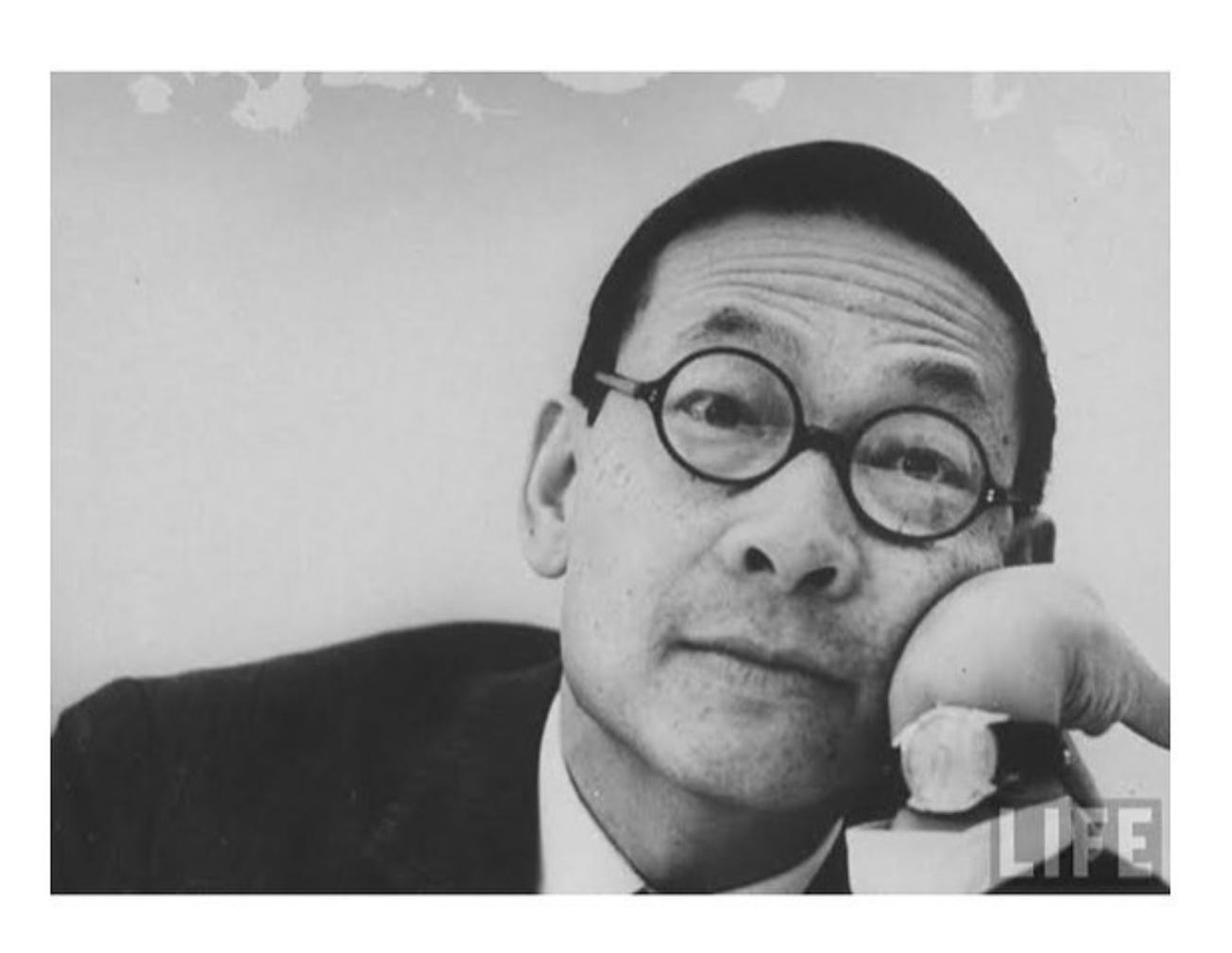
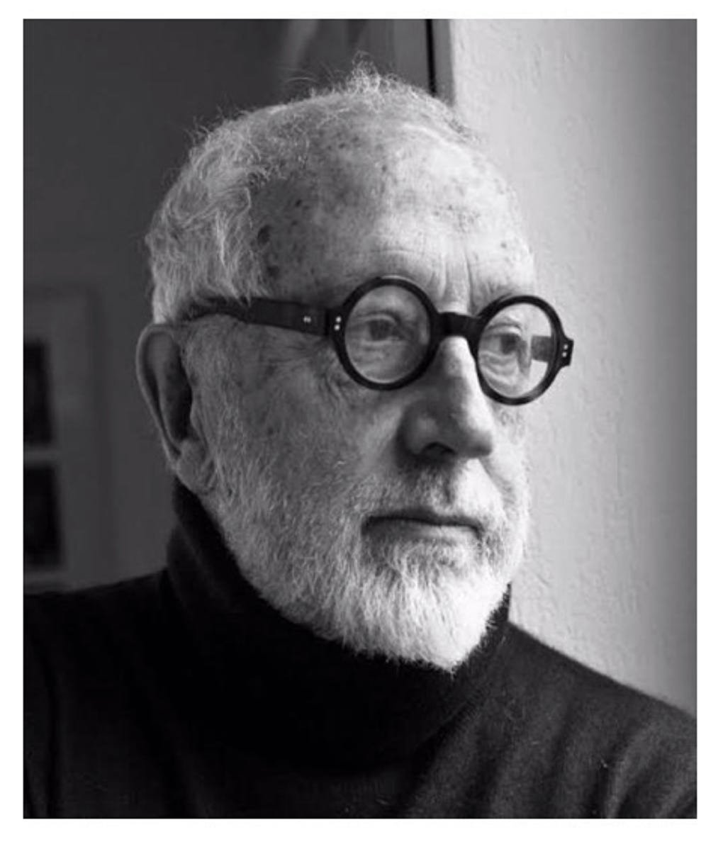
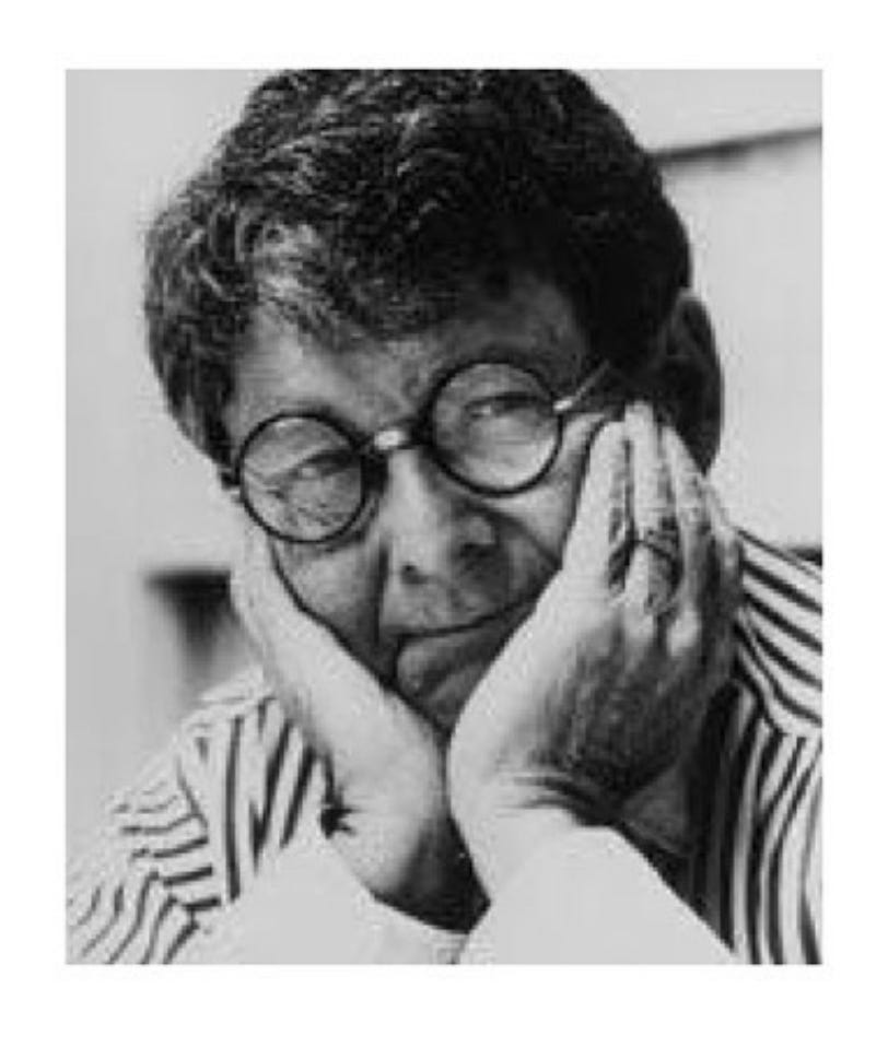
IM Pei, Peter Cook, John Hejduk, Richard Meir, Peter Eisenman, Mario Botta, Stanley Tigerman, Nicholas Grimshaw, Andrea Branzi – the list goes on and on.

The Israeli designer and architect Rod Arad created a line of glasses for PQ eyewear that were called “Corbs” – although ironically they are fully circular in design which lends them more to Johnson’s version…
Other eye-wear manufacturers have taken to naming designs as ‘architect frames’ or even just ‘architects’ – and there are a myriad of style editorials parading the frame choices of great designers of the twentieth century.
You can buy a pair today thanks to Maison Bonnet, the bespoke French glasses designer who made pairs for Le Corbusier later on in his life – as well as the frames for another designer notable for his glasses – Yves Saint Laurent.

The City Boy’s braces, the Art Director’s beanie, the College Professor’s elbow pads – all notable stylistic cues and signifiers of the job, but costumed cliches nonetheless.
Trends in building materials, fashion and design culture are constantly in flux, but the architect’s glasses endure – thanks to Le Corbusier.
Round and round and round and round…


New is great isn’t it? We love all things new.
Well not all of us. Some brands have been applying the same schtick for yonks.
Uniformity has such negative connotations, but the expected tropes of certain brands, products and advertising can be super effective as shortcuts to attention or trust.
Hanging on to a long term concept can be pretty tough these days but it used to be the norm – espcially when you had a banging jingle or a particular tone of voice.
Or just a great voice! EA really got in the zone from about 2000.
They should run this until the wheels fall off.

An eggcellent question that still gets asked 🥚
No Cocteau Twins record was complete without the Vaughn Oliver sleeve.

Likewise, everything from Factory had to have the Peter Saville touch.

Cheetos continuously chose Chester, and thank God! because it gave us the gift of this excellent Family Guy cutaway 🧀
You don’t even need to have the whole thing written out…

A glass and half and always purple. Whatever is happening.
There used to be a lot of “Men from” in ads didn’t there? The Milk Tray man, the Hathaway man. I’m going to pick out The Man from Del Monte as a great example of a beloved mascot or man-scot, mostly because the classic original reminds me of scarface but with orange juice.
The longest rolling ad in TV history
Iconic.
A great read on the subject of uniformity in creativity.


Ready to put it on?
Like, comment and subscribe etc!
Thanks for reading,
Jonathan ✌️

🐦 Liberty, liberty, liberty
🪦 RIP tribes
🏠 Fully furnished
🧥 I must have Liam’s jacket
👂 We have to be able to hear other people